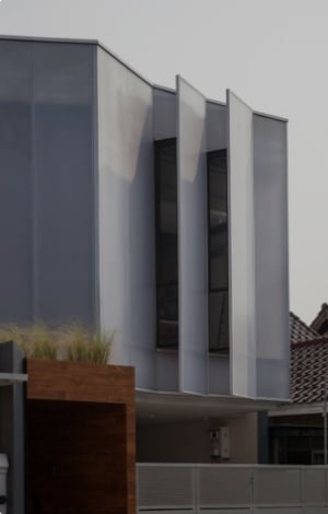
THE ‘LESS IS MORE’ APPROACH TO INTERIOR COLOUR SCHEMES


We’ve all heard the saying that ‘less is more’, and with minimalism now more popular than ever, this monochrome palette offers an approach to design that embraces only the essentials. Or in the words of Marie Kondo, “sparks joy”.
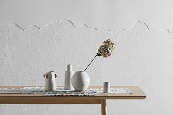
Colours used are Haymes Soft Feathers and Haymes Artisan Rendercoat in White Stone
Wendy Rennie, Haymes Colour and Concept Manager, says “Deep Calm focuses less on colour and more on tonal shifts that graduate throughout the interior”.
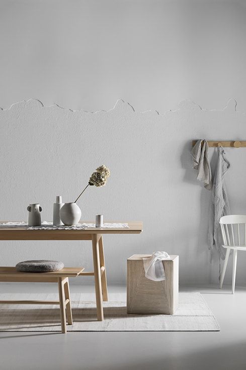
Colours used are Haymes Soft Feathers and Haymes Artisan Rendercoat in White Stone
While many would assume that sticking to one colour would create a space that is dull and uninspired, by varying the tones of the colour and experimenting with textures and materials, you can create a look that is unique, unexpected and totally ready to make an appearance on your Instagram feed.
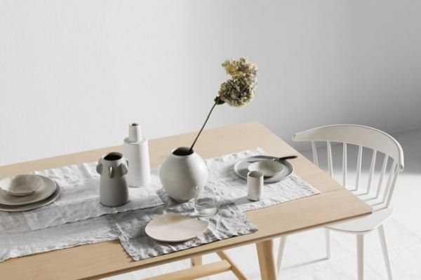
Colour used is Haymes Artisan Rendercoat in White Stone
Wendy says, “too often we try to overcomplicate our colour palettes, and Deep Calm highlights just how beautiful simplicity can be”.
Colour Tip: Don’t underestimate the power of different saturations of the same colour. For whites and neutrals, a full-strength colour might work best on your interior walls, best complemented by half-strength colour on the ceilings and double-strength on the doors and trims.
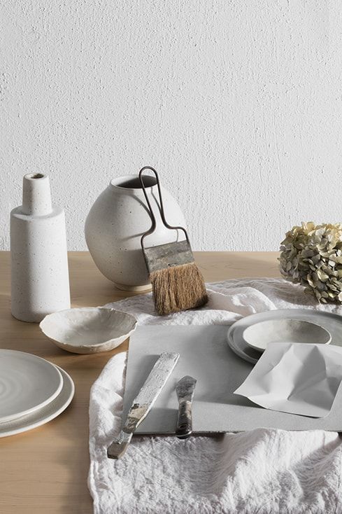
Colour used is Haymes Artisan Rendercoat in White Stone
As seen in the Deep Calm palette, balancing a neutral colour scheme against natural and organic textures breathes life, infuses calm and keeps the space peaceful without looking uniform.
Product Tip: Experiment with contrasting different paint finishes like matte and high gloss in the same colour to add a unique element to any space.
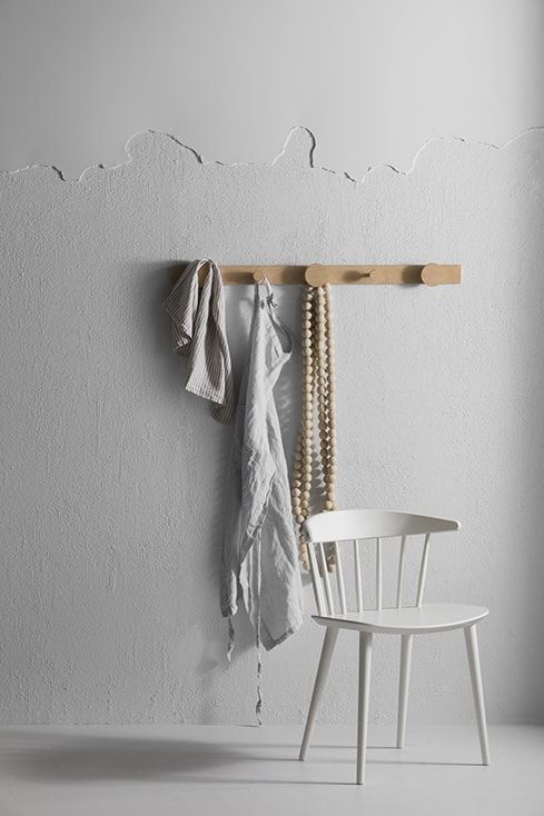
Colours used are Haymes Soft Feathers and Haymes Artisan Rendercoat in White Stone
One of the best features of tone on tone colour schemes is that you have the ability to make them as subtle or bold as you wish, depending on the key colour you choose to work with.
Thank you to our suppliers Canvas + Sasson, Cone 11 Ceramics, Cultiver, Globewest, Halcyon Lake, Hale Mercantile Co., House of Orange, Hub Furniture, Open Room, Plyroom, Southwood Home, Tide Design and Wingnut + Co.
Photography by Martina Gemmola
Styling by Ruth Welsby


 Indonesia
 New Zealand
 Philippines
 Hongkong
 Singapore
 Malaysia


