Indonesia
 New Zealand
 Philippines
 Hongkong
 Singapore
 Malaysia


Through the vines: Zespri HQ


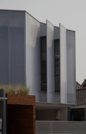
From above, this 8000m2 building is a simple composition: a large, two-storeyed rectangular form bisected vertically (north to south) at ground level by a smaller, thinner version of the first. On the outside, this secondary arm introduces a materiality of warm, cedar battens to an otherwise industrial palette of glass, glazed aluminium and concrete (with a vertical pattern echoing the timber). Its northern wing is surrounded by a public park and it houses meeting rooms and hospitality areas. Its southern wing (adjacent to a small car parking area) acts as a porte cochère that leads to a compressed (3-metre tall) arrival sequence, which then erupts into a dramatic, internal verticality.

Thermosash sun shades. Image: Samuel Hartnett
It is here, at the main public core just above the intersection of those two rectangles, where Warren and Mahoney’s interior language is at its most recognisable. A generous atrium, presided by a wide staircase (in light timbers) with plenty of bump opportunities, and overhead, slightly protruding meeting rooms adding a touch of movement and vibrancy to an otherwise grand void.
Warren and Mahoney has used many of these motifs often over the years. The wide timber staircase, for instance, is reminiscent of the amphitheatre-styled seating/stairs the firm has included in everything from civic and workplace projects through to its own Auckland and Christchurch studios.
Within these signature interior moves, however, one can often find material choices that allude to the unique nature or history of the business that takes place within its halls.
At Zespri’s headquarters, the interior language has been accented by the dialect of the countryside. “I grew up on a kiwifruit orchard in Te Puke,” says Asha Page, the architects’ interior lead for this project, “which is the ‘kiwifruit capital of the world’ according to our tagline. So that was a really a nice angle for me because I understood exactly what it was like to live and breathe every part of the brief.”
Page spent many of her formative years helping her father – architect David Page from Architecture Page Henderson, whose firm served as a Zespri site observer – in one of his orchards. She is well versed with both the intricacies of how these gooseberries grow (on either pergolas or A-frames, apparently) and with the seasonal changes of canopy and its corresponding filtered light. “It was kind of a nice local flavour rather than these Auckland architects coming down and… you know, telling them what to do,” says Asha.

A triangular skylight references Mount Maunganui’s shape and the dappled light of kiwifruit vines. Image: Samuel Hartnett
Did that first-hand knowledge of context help in any way? “Yes, I think it really helped in terms of hitting the right tone of the materiality,” she says, pointing out concrete floors akin to those in orchard pack houses and the use of expanded mesh (instead of the ubiquitous glass) as balustrade. Asha explains how during early design discussions she was: “Always talking about the dappled light you get when you walk underneath a pergola and how distinctive that light is through the leaves depending on the season”.
As such, Zespri’s atrium is capped by a large skylight – triangular to reference the Mount a mere 2kms away. This, in turn, has been speckled with colour patterns to emulate the light filtering through autumnal kiwifruit vines. Asha explains how they applied a graphic detailing to the skylight – arrhythmic dots in green and brown – “and that showed the depth of light and created great, beautiful shadows on the floor and at different times of the day.”
This move works particularly well with the external cladding: folded aluminium sun shades that act as origami versions of foliage, further modulating dappled light into an already biophilic interior.

The interior’s colour strategy is twofold: brand-driven and wayfinding-oriented. The former uses fresh, crisp tonalities within a green and white spectrum while the latter is more autumnal, earthy and warm.
This new building also served as an impetus for Zespri to move into activity-based working and the architects’ used colour, materiality and details such as furniture handles and décor to define four distinct work areas, each themed around the different urban and rural settings in which Zespri is usually found or enjoyed.
According to the architect: “Zespri undertook a workplace strategy process with Veldhoen + Company and this determined that activity-based working was the best workplace style for them,” as they sought, among other things, “to connect people, to achieve more effective work because the setting fits the task better and to drive a more dynamic, vibrant workplace.” Warren and Mahoney then took this strategic brief and brought it to life. According to Asha: “The principles of activity-based working and greater use of technology meant that Zespri staff were well placed to work remotely and observe COVID-19 protocols”.

The colour and material palette sought to emulate both corporate branding and the seasonal moods of the orchard. Image: Samuel Hartnett
By their very essence, corporate interiors for multinationals need to please a large group of stakeholders. This is particularly true of agricultural cooperatives, where everyone from orchardists through to CEOs have an embedded sense of ownership, both in the business and its physical representations. As such, these interiors tend to do things conservatively and Zespri is no different.
This headquarters, however, responds in a sensitive yet business-appropriate fashion to its users. It speaks to its cooperative structure by seeking to reflect and welcome both pack house and orchard workers as much as international corporate visitors, mixing the language of the orchard with the dialect of the corporation. It succeeds, in subtle ways and through well-tried motifs.