The design brief called for a distinct cocktail bar with a distinct Spanish tone, seamlessly integrating the concept of a card game, symbolized by the name “Carta.” The result is a striking structure, where the building massing takes the form of stacked boxes—each representing a die in a game of chance. This unique interpretation of the theme evokes the randomness and unpredictability of a card game, while also becoming an engaging architectural form within the vibrant urban context of Jakarta's commercial heart.
The exterior is a testament to this concept, with varying levels and volumes that not only create an eye-catching facade but also engage the surrounding urban fabric. The topmost boxes, designed to be lighter and more transparent, are finished with a polycarbonate-like material that allows light to filter through, creating a glowing presence at night. This transparent quality gives the building an airy inviting curiosity while offering glimpses of the lively interior. The upper volumes seem to float delicately above, allowing the space to feel open and connected to the sky.
In contrast, the lower boxes have a more solid and grounded appearance, with their surfaces covered in a bold, bright orange washed paint. This vibrant color anchors the building, providing a striking contrast to the more delicate upper volumes. The orange tones draw attention, ensuring the bar is a memorable landmark within the SCBD district. Unifying the massing of the building is the use of 200x200mm glass blocks, which form a distinct and cohesive element at the heart of the facade. These glass blocks, with their subtle texture and translucent quality, create a rhythm of smaller 'boxes' within the larger architectural form. The glass blocks act as a bridge between the upper transparent volumes and the more solid lower ones, bringing unity to the design while maintaining a balance of light, shadow, and texture.
Inside, Carta continues to embrace its Spanish design elements with a tint of contemporary flair. The walls, adorned with a distinctive orange-washed paint, cast a warm, inviting glow throughout the venue. The choice of the orange tones not only adds depth to the space but also complements the other materials, enriching the overall warmth of the environment.
The flooring itself is a visual feast as it features a collection of patterned tiles that add texture and charm. With subtle Spanish-inspired motifs, these tiles offer a bit of playfulness to the space, while still maintaining a refined simplicity. Interspersed among these tiles are bold green mosaics, a vibrant contrast that adds a layer of excitement to the otherwise earthy palette. These green mosaics, with their organic and tactile finish, serve as both a visual focal point and a tactile element, inviting guests to interact with the space on a deeper level.
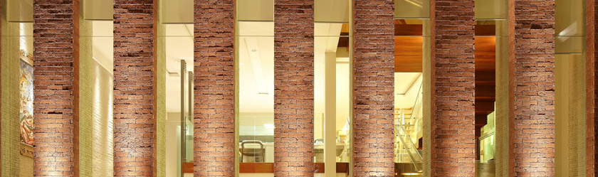
One of the standout features of the interior is the elegant archways that frame key moments throughout the bar. These arches, inspired by Spanish architectural traditions, evoke a sense of classical grandeur and provide a visual connection between different areas of the space. They help to guide movement and establish zones within the open-plan layout, offering both a sense of intimacy and continuity. Their soft curves, reflect a classic Spanish design influence while maintaining a modest and understated elegance. The ceilings, gently curved and unadorned, add a sense of movement and openness without overwhelming the space. They help keep the atmosphere light and airy, while still evoking a sense of traditional warmth and charm.
These contrasting elements—curved lines, arches, and varied seating—bring a harmonious yet playful balance to the space, making Carta Bar a unique blend of form, function, and cultural resonance. Together, the modest elements of the interior—warm colors, simple motifs, and inviting furniture—create a place that feels both familiar and special, a perfect setting for enjoying good company and conversation.
The design brief called for a distinct cocktail bar with a distinct Spanish tone, seamlessly integrating the concept of a card game, symbolized by the name “Carta.” The result is a striking structure, where the building massing takes the form of stacked boxes—each representing a die in a game of chance. This unique interpretation of the theme evokes the randomness and unpredictability of a card game, while also becoming an engaging architectural form within the vibrant urban context of Jakarta's commercial heart.
The exterior is a testament to this concept, with varying levels and volumes that not only create an eye-catching facade but also engage the surrounding urban fabric. The topmost boxes, designed to be lighter and more transparent, are finished with a polycarbonate-like material that allows light to filter through, creating a glowing presence at night. This transparent quality gives the building an airy inviting curiosity while offering glimpses of the lively interior. The upper volumes seem to float delicately above, allowing the space to feel open and connected to the sky.
In contrast, the lower boxes have a more solid and grounded appearance, with their surfaces covered in a bold, bright orange washed paint. This vibrant color anchors the building, providing a striking contrast to the more delicate upper volumes. The orange tones draw attention, ensuring the bar is a memorable landmark within the SCBD district. Unifying the massing of the building is the use of 200x200mm glass blocks, which form a distinct and cohesive element at the heart of the facade. These glass blocks, with their subtle texture and translucent quality, create a rhythm of smaller 'boxes' within the larger architectural form. The glass blocks act as a bridge between the upper transparent volumes and the more solid lower ones, bringing unity to the design while maintaining a balance of light, shadow, and texture.
Inside, Carta continues to embrace its Spanish design elements with a tint of contemporary flair. The walls, adorned with a distinctive orange-washed paint, cast a warm, inviting glow throughout the venue. The choice of the orange tones not only adds depth to the space but also complements the other materials, enriching the overall warmth of the environment.
The flooring itself is a visual feast as it features a collection of patterned tiles that add texture and charm. With subtle Spanish-inspired motifs, these tiles offer a bit of playfulness to the space, while still maintaining a refined simplicity. Interspersed among these tiles are bold green mosaics, a vibrant contrast that adds a layer of excitement to the otherwise earthy palette. These green mosaics, with their organic and tactile finish, serve as both a visual focal point and a tactile element, inviting guests to interact with the space on a deeper level.
One of the standout features of the interior is the elegant archways that frame key moments throughout the bar. These arches, inspired by Spanish architectural traditions, evoke a sense of classical grandeur and provide a visual connection between different areas of the space. They help to guide movement and establish zones within the open-plan layout, offering both a sense of intimacy and continuity. Their soft curves, reflect a classic Spanish design influence while maintaining a modest and understated elegance. The ceilings, gently curved and unadorned, add a sense of movement and openness without overwhelming the space. They help keep the atmosphere light and airy, while still evoking a sense of traditional warmth and charm.
These contrasting elements—curved lines, arches, and varied seating—bring a harmonious yet playful balance to the space, making Carta Bar a unique blend of form, function, and cultural resonance. Together, the modest elements of the interior—warm colors, simple motifs, and inviting furniture—create a place that feels both familiar and special, a perfect setting for enjoying good company and conversation.
 Indonesia