AWARD
Milan, Italy A’ Designs Award
As the Gold-award-winning project of A’ Designs Award (Milan, Italy), “LaPuro” comes from French, meaning “pure, clear and limpid”. The visual identity and spatial planning inspired by milk and honey, echoes with the concept of purity. The color white is extensively used in the monotone design, capitalizing on utility and comfort, as well as highlighting milk’s nurturing nature. The movement of flowing honey is illustrated by elegant ogee curves connecting the space.
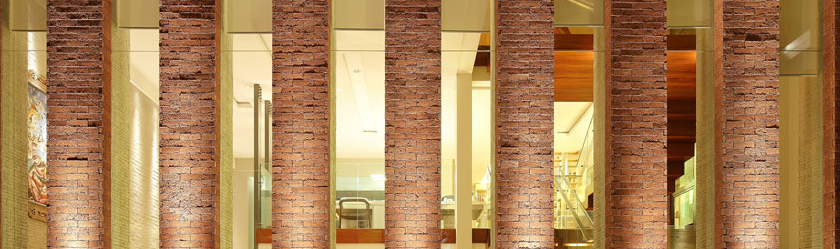
 Hong Kong SAR